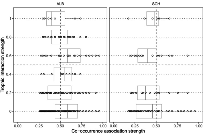
FIGURE 3.

Quadrant analysis showed incongruence between the actual interaction strength and predicted co‐occurrence association strength per region. Each empty point represents a pair of plants and butterfly species. To aid visualization, we added dashed black lines that divide each plot into four quadrants and thin dotted black lines for each trophic level. At specified interaction strengths of 0 (low), 0.2, 0.4, 0.6, 0.8, and 1 (strong), the boxes show the interquartile range, that is, the first and third quartiles (the 25th and 75th percentiles).
