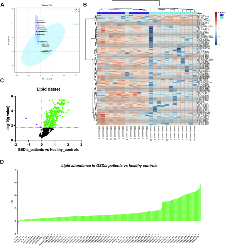
Fig. 1.
Glycogen storage disease type Ia (GSDIa) lipidomic signature model. A: A principal component analysis (PCA) was performed using the normalized lipid dataset. Patients with GSDIa and healthy controls are represented by different colors (dark blue: patients with GSDIa; light blue: healthy controls). Phenotype conditions showed clear separation according to two principal components (PCs), explaining 25.9% of the total variance (PC1 18.5% and PC2 7.4%). B: Hierarchical cluster analysis and heatmap visualization of the lipid dataset top 100 (y-axis) ranked by a t test (P < 0.05). Serum lipid abundance was log (10) transformed and Pareto scaled. The color code of the heatmap represents the relative metabolite abundance: red and blue represent increased and decreased levels of each lipid in patients with GSDIa versus healthy controls, respectively. C: Volcano plot analysis of differential lipid abundance in patients with GSDIa versus healthy controls. The relative abundance of each lipid was plotted against its statistical significance, reported as Difference (log 10 abundance) and -log10 (q-value), respectively. Purple and green dots refer to significantly decreased and increased lipids. Black dots refer to all the lipids identified in the dataset whose relative abundance is not significantly changed between patients with GSDIa vs. healthy controls. D: The plot shows the differential lipid abundance in patients with GSDIa versus healthy controls. Purple and green bars refer to significantly decreased and increased lipids, respectively.

