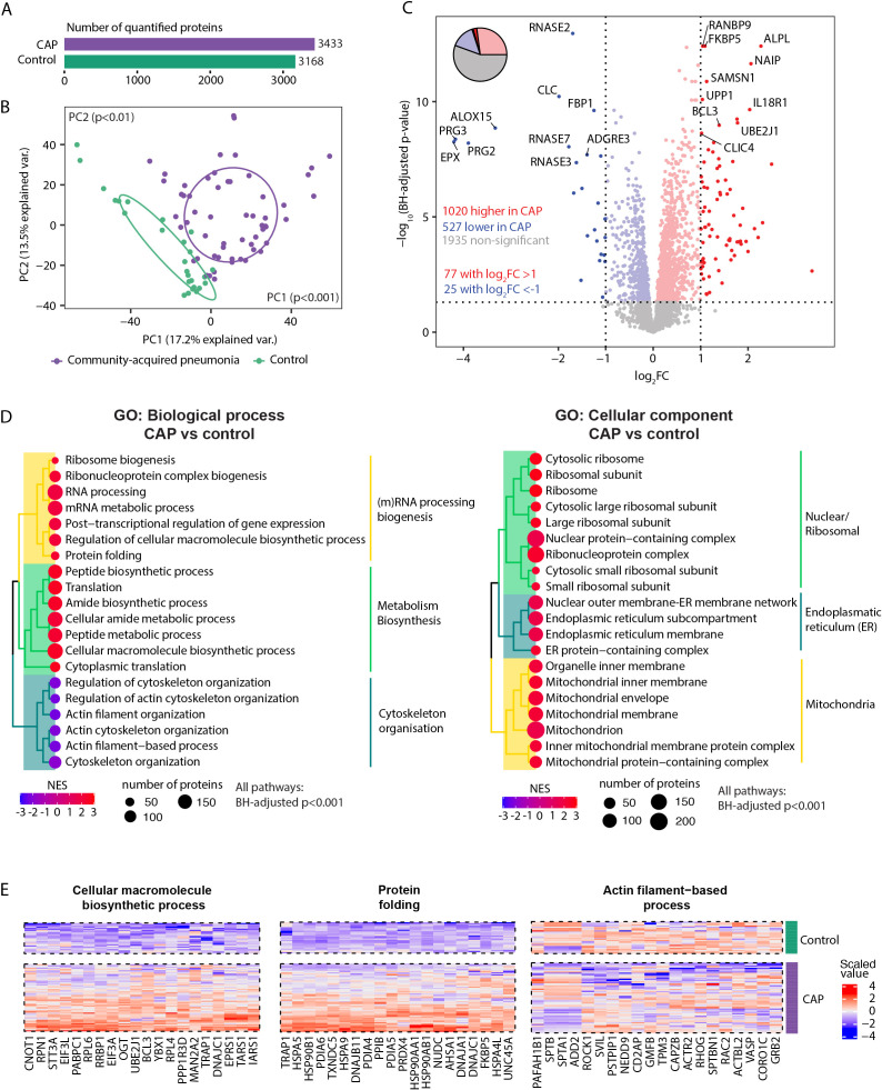
Figure 1.
Neutrophil proteome in community-acquired pneumonia (CAP) patients and controls. (A) Number of quantified proteins stratified by group. (B) Principal component analysis (PCA) of all quantified proteins stratified by group. Each dot represents an individual subject. The ellipse indicates the central 50% of each group, color-coded as shown in the bottom part of this panel. P-values were derived from a t-test comparing the PCs between groups. (C) Volcano plot depicting the magnitude and significance of differences in neutrophil protein abundance between CAP patients and controls. P-values are derived from a limma differential expression analysis, including empirical Bayes moderation and Benjamini-Hochberg (BH) correction. Red dots represent proteins significantly more abundant in CAP patients, and blue dots represent proteins significantly lower in CAP patients. Dots with decreased transparency represent significant proteins with a Log2 fold change (FC) between -1 and 1. The pie chart visually represents the distribution of proteins with significantly different abundances between the groups. (D) Left panel; results of untargeted pathway analysis of the differences in neutrophil protein abundance between CAP patients and controls using the Gene ontology (GO) Biological Process database (31). The top 20 significantly different pathways are displayed and clustered based on the similarity of proteins in each pathway using Ward’s clustering and the Enrichment plot R-package (33). Normalized Enrichment Scores (NES) were used to quantify the magnitude of the difference. Right panel; similar method as left panel but now using the GO: Cellular Component database (31). (E) The top 20 driving proteins of the most significantly different paths per GO: biological process pathway cluster.

