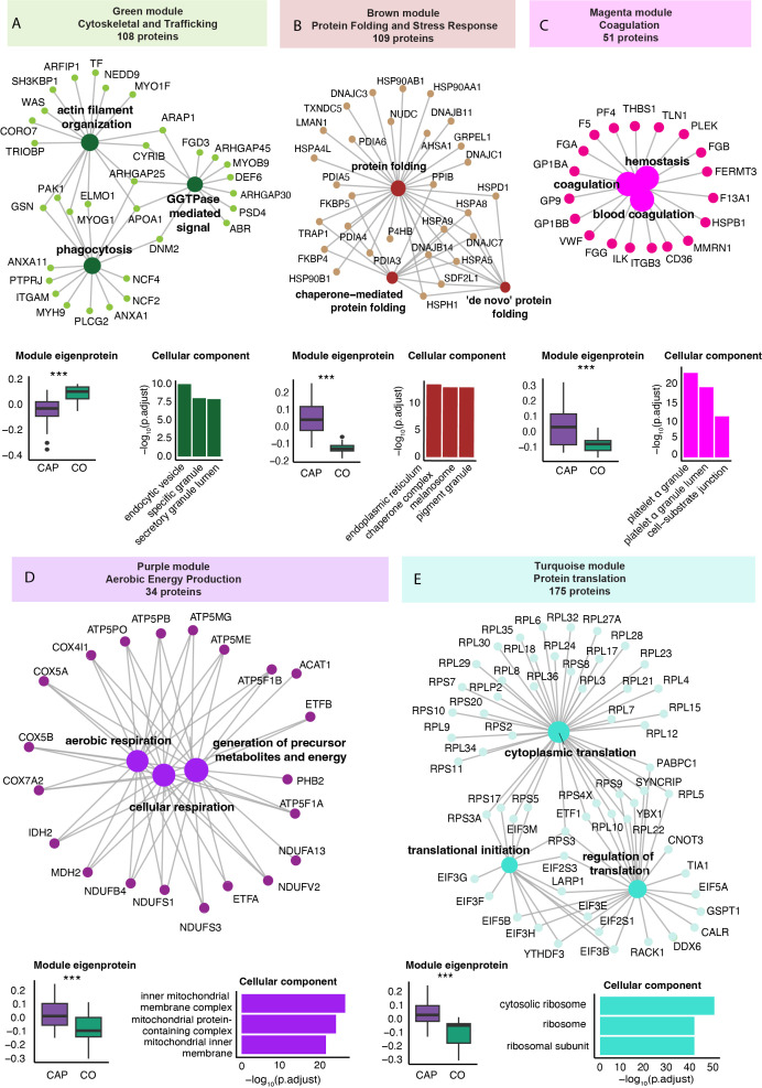
Figure 3.
Weighted correlation network analysis of the neutrophil proteome in community-acquired pneumonia (CAP) patients and controls. (A) Network visualization of the three most significant Gene Ontology Biological Process (GO: BP) pathways (large dots) as determined by an overrepresentation analysis of the proteins in the green module. The numbers in the colored boxes represent the total number of proteins in the module. Displayed protein names (small dots) reflect the proteins in these top three GO: BP pathways. The boxplot in the left lower corner depicts the variation in the module score, representing the overall protein abundance pattern of all the modules’ proteins. P-values were derived from the Wilcoxon test comparing the module score between groups. The higher value of the green module score in controls (CO) compared to CAP patients indicates a higher abundance of these proteins in controls compared to CAP. The bar chart in the lower right corner reflects the three most significant GO Cellular Component pathways equally determined by an overrepresentation analysis. Collectively, this panel illustrates that CAP patients display a lower abundance of the 108 proteins in the green module (boxplot), which are functionally related to phagocytosis and cytoskeletal organization (network) and mainly originate from vesicles and granules (bar chart). (B) Brown protein module [methods as in (A)]. (C) Magenta protein module [methods as in (A)]. (D) Purple protein module [methods as in (A)]. (E) Turquoise protein module [methods as in (A)]. *** p<0.001 after Benjamini-Hochberg correction for multiple testing.

