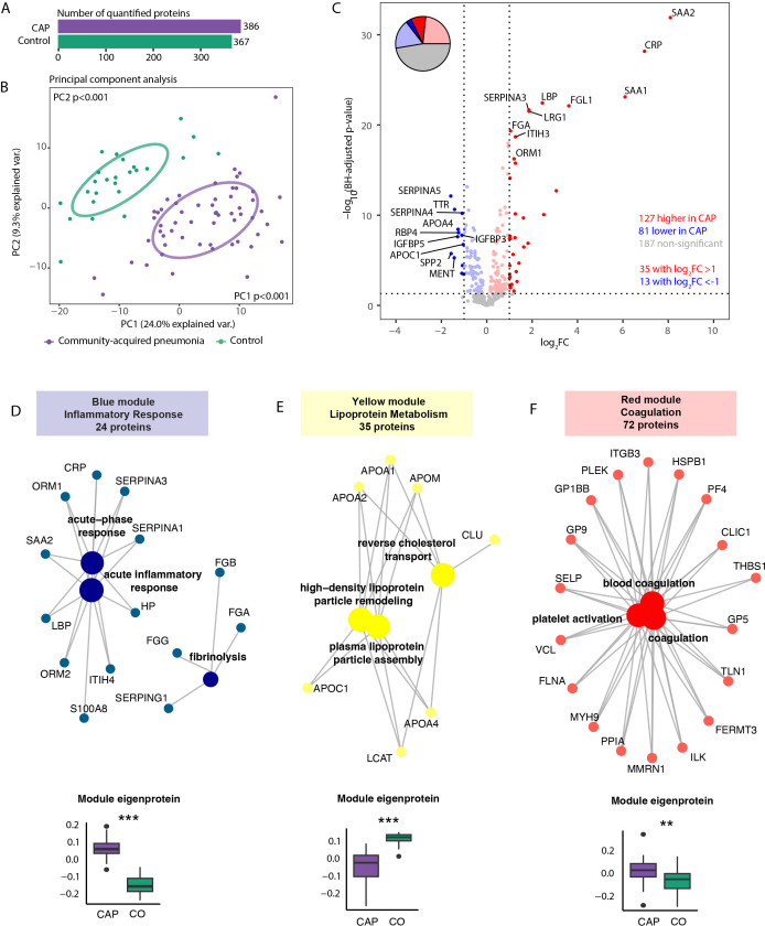
Figure 5.
Plasma proteome in community-acquired pneumonia (CAP) patients and controls. (A) Number of quantified proteins stratified by group. (B) Principal component analysis (PCA) of all quantified proteins stratified by group. Each dot represents an individual subject. The ellipse indicates the central 50% of each group, color-coded as shown in the bottom part of the figure. P-values were derived from a t-test comparing the PCs between groups. (C) Volcano plot depicting the magnitude and significance of differences in plasma protein abundance between CAP patients and controls. P-values are derived from a limma differential expression analysis, including empirical Bayes moderation and Benjamini-Hochberg (BH) correction. Red dots represent proteins significantly more abundant in CAP patients, and blue dots represent proteins substantially less abundant in CAP patients. Dots with decreased transparency represent significant proteins with a Log2 fold change (FC) between -1 and 1. The pie chart visually represents the distribution of proteins with significantly different abundances between the groups. (D) Blue plasma protein module using a method similar to the neutrophil protein network analysis (see legend of Figure 3 for an extensive explanation) (E) Yellow plasma protein module. (F) Red plasma protein module. CO: controls. **p<0.01 and ***p<0.001 after Benjamini-Hochberg correction for multiple testing.

