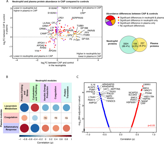
Figure 6.
Relation between neutrophil and plasma proteome in community-acquired pneumonia (CAP) patients and controls. (A) Quadrant plot visualization of proteins that overlap between neutrophils and plasma. The x-axis denotes the magnitude of the difference in neutrophil protein abundance between CAP patients and controls. The y-axis indicates the difference in plasma protein abundance. Dots are colored based on the significance of comparisons. *CRP demonstrated a plasma Log2 fold change (FC) of 7 but was lowered to facilitate visualization. (B) Spearman’s correlation between neutrophil and plasma module scores. A positive correlation between modules suggests that a high abundance of the proteins comprising one module are associated with a high abundance of the proteins of the other module. Red colors represent positive associations, and blue colors negative associations. Shades of red indicate positive associations, while shades of blue denote negative associations. The magnitude of the association is depicted by both the size of the dot and the intensity of the color: larger dots and more saturated colors correspond to stronger associations. For instance, the pronounced positive correlation between the ‘Inflammatory Response’ module in plasma (blue) and the ‘Protein Folding and Stress Response’ module in neutrophils (brown) suggests that, for most patients, an increase in the plasma protein levels within the blue module corresponds with a rise in the abundance of proteins within the brown neutrophil module. (C) Spearman’s correlation between the inflammatory response in plasma, reflected by the blue module score, and individual neutrophil proteins in CAP patients. Abbreviations; ns: non-significant, BH; Benjamini-Hochberg.

