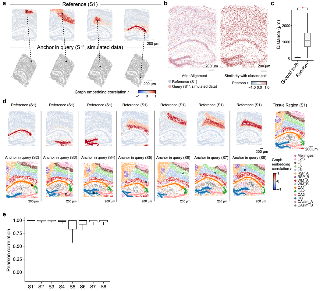
Extended Data Fig. 3 |. Pearson correlation of CAST Mark graph embedding between cells is a robust similarity metric for cell locations across samples.

a, Given the query cell in the query slice (simulated dataset S1’), the cells in the reference sample (S1) are colored by Pearson’s correlation of the graph embedding between the reference cell and the given query cell in the query sample (S1’). b, Left panel, the coordinates of the S1 and the S1’ after alignment (same as Fig. 2d). Right panel, each cell in the query sample is colored by Pearson correlation of the graph embedding between itself and its closest pair in the reference sample. c, The boxplots show the significantly closer physical distances (One-way ANOVA; p-value < 2.2e-16) of the correct cell pair (ground truth, mean = 37.82 μm, sample size = 8,789) than the ones in random cell pairs (Random, mean = 1133.49 μm, sample size = 8,789). d, Given a query cell in the query sample (S2–S8), the cells in the reference sample (S1) are colored by Pearson’s correlation of the graph embedding between the reference cells and the given query cell. Cells with high Pearson’s correlation in the reference sample show similar relative spatial locations to the query cell. In the bottom panel, cells in the query samples are colored by tissue region labels produced by CAST Mark (same as Fig. 1c for visualization). e, The boxplots show the high Pearson correlation of the graph embedding between the cells in query samples (S1’ and S2–S8) and the reference cell with the closest physical distance in the reference sample (S1). Average Pearson r: 0.99 (S1’, n = 8,789), 0.95 (S2, n = 8,506), 0.94 (S3, n = 9,428), 0.93 (S4, n = 8,034), 0.82 (S5, n = 8,202), 0.88 (S6, n = 8,186), 0.91 (S7, n = 9,634) and 0.92 (S8, n = 10,372). In the boxplots in c and e, the middle line indicates the median; the first and third quartiles are shown by the lower and upper lines, respectively; the upper and lower whiskers extend to values not exceeding 1.5 times the IQR.
