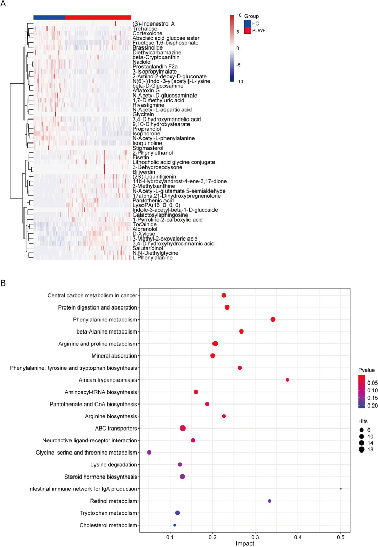
Fig 4.
Fecal metabolite analysis using liquid chromatography-mass spectrometry. (A) The top 50 differentially abundant metabolites between the PLWH and HC groups shown as a heatmap. (B) The top 20 enriched KEGG metabolic pathways between the two groups shown as a bubble chart. The metabolic pathways are on the y-axis, and the rich factor (the number of significant differentially abundant metabolites/the total metabolites in the pathway) is on the x-axis. A larger rich factor indicates a greater degree of enrichment. Change in the color from blue to red indicates a decreasing P value; the bigger the dot, the higher the number metabolites enriched in the pathway.

