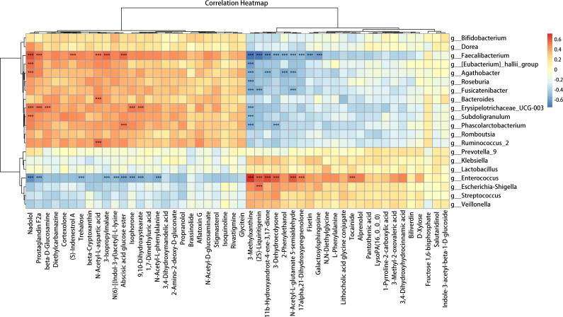
Fig 5.
Correlation analysis of the top 50 differentially abundant metabolites and bacteria between the PLWH and HC groups shown as a heatmap. Associations between the differentially abundant bacteria and the top 50 differentially abundant fecal metabolites were analyzed using Spearman correlations based on their relative numbers.

