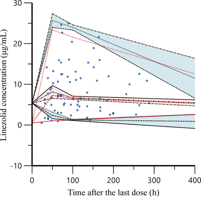
Fig 4.

Prediction corrected-visual predictive check of the final model. The observed linezolid concentrations are shown as blue circles. Red solid and dashed lines represent the 5th, 50th, and 95th percentiles of the observed concentrations; the three shaded areas represent the 90% CIs of the 5th, 50th, and 95th percentiles of the simulated concentrations.
