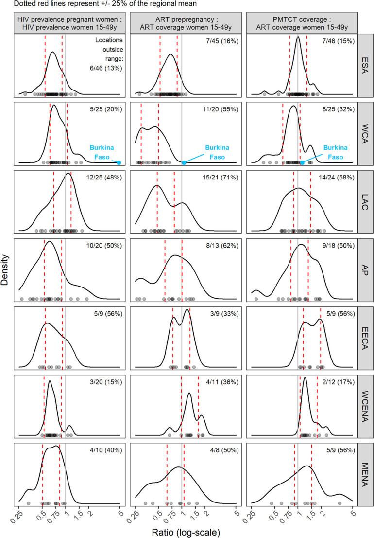
FIGURE 2.

Prevalence, ART prepregnancy, and PMTCT ratio by region. Points on the x-axis represent distribution of ratios for all locations. Red dashed lines represent typical ranges of each ratio by region calculated as 0.75–1.25 times the mean value. Curved lines show density of ratios by region, with more common ratios represented as peaks. Multimodal distributions represent within region heterogeneity of ratios, meaning the “typical” ranges should be interpreted with caution.
