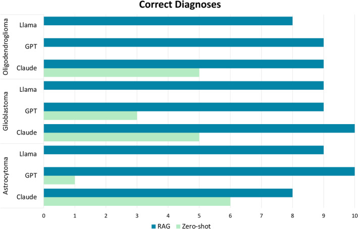
Figure 2.

Correct diagnoses by tumour type. This bar chart presents the total number of correct diagnoses made by each model for each tumour type, where dark blue represents zero‐shot correct response and light green RAG correct responses. The bar is absent for some of the zero‐shot experiments because no correct diagnoses were generated for these cases. This figure demonstrates that correct diagnoses were made much more frequently by all models in the RAG experiments than the zero‐shot experiments.
