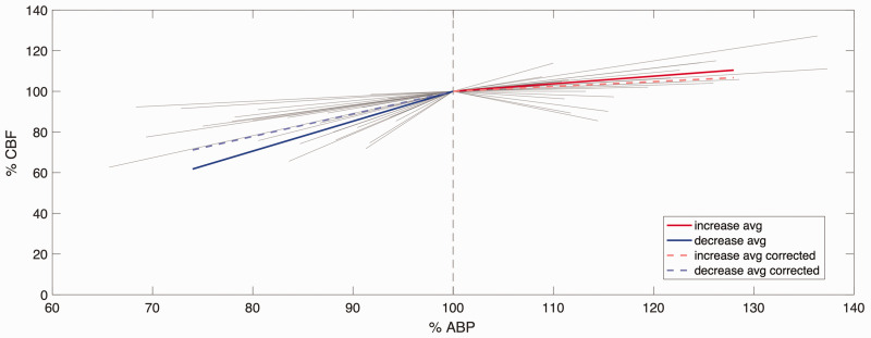
Figure 3.
Relationship between %MAP and %CBF in the increased MAP and decreased MAP ranges. All individual lines represent individual experiments (not corrected for CO2); the length of the line indicates the range of MAP of that experiment. Before CO2 correction, average slope (solid line) was 1.47%MAP/%CBF for the decreased MAP (n = 27), and 0.35%MAP/%CBF for increased MAP (n = 17). After CO2 correction, the average slope (dashed line) was 1.11%MAP/%CBF for decreasing MAP (n = 18) and 0.24%MAP/%CBF for increasing MAP (n = 11).

