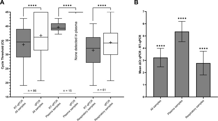
Fig 2.
(A) Comparison of mean cycle thresholds between RT-qPCR and qPCR according to different sample types. (B) Corresponding mean ΔCt, computed as the difference between the Ct obtained in qPCR and that obtained in RT-qPCR. In Fig. 1A, the middle line of the boxplot indicates the median, and the cross indicates the mean. The bar indicates the minimum and maximum values. In Fig. 1B, the bar indicates the CI95% of the mean ΔCt. ****: P < 0.0001.

