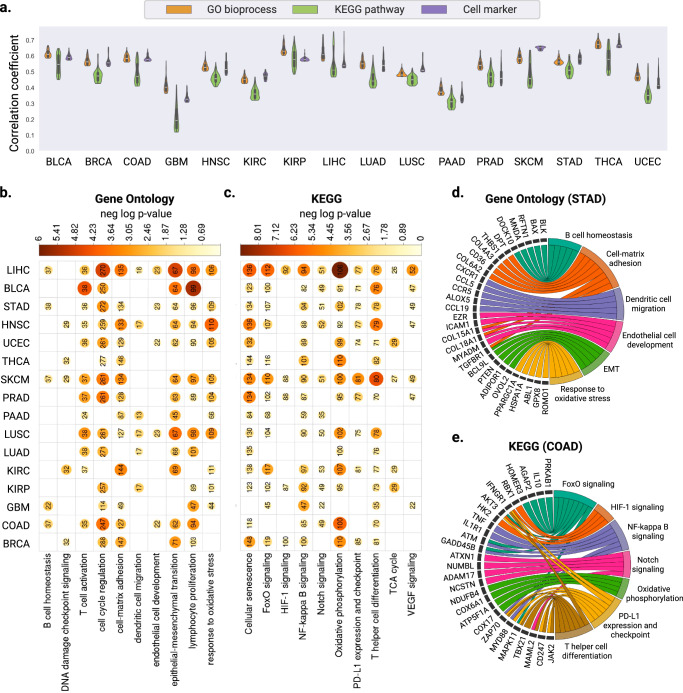
Fig. 3. Evaluation of gene expression predictions at the pathway level.
a Violin plots illustrating the distribution of Pearson correlation coefficients (left y axis) between the predicted and ground truth pathway enrichment scores in TCGA test sets. Within each violin plot, a miniature box-and-whisker plot is shown where whiskers bound the min-max values of the data, the bounds of the box represent lower (Q1)/upper (Q3) quartiles, and the central value contains the median value. The top 100 pathways with the highest correlation coefficients obtained from each model are shown. b, c Heatmap showing the significant P values obtained from one-sided hyper-geometric tests in b gene ontology and c KEGG pathway analysis of the well-predicted genes. Color and size of the circles represent the negative log-transformed P values. Integers represent the absolute gene count in each category, and non-significant categories are left in blank. d, e Circos plots showing the d biological process enriched with the well-predicted genes in STAD and e KEGG pathways in COAD. Gene names are displayed on the left and the corresponding biological processes are shown on the right. Source data for all panels are provided in the Source Data File.

