Figure 2.
Identification and characterization of eQTLs
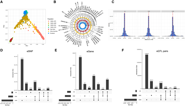
(A) PCA plot showing the population structure of individuals in our study as well as the 1000 Genomes Project. AFR, African; AMR, American; EAS, East Asian; EUR, European.
(B) Circos manhattan plot of significant eQTL genes among the three populations with highlighted top 50 fine-mapped eGenes. Each layer of the plot represents results from an eQTL analysis, with results from the same ancestry grouped by color. The blue panel represents EUR, red panel represents EAS, and the yellow panel represents AA. Significant eQTL are plotted as points.
(C) Distance distribution between eSNP to TSS of eGenes.
(D–F) Upset plot showed overlap among the significantly associated (D) eSNPs, (E) eGenes, as well as (F) eQTL pairs between populations.

