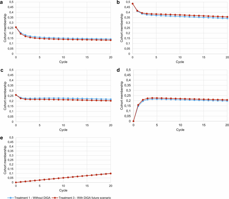
Fig. 1. Markov probability analysis.
Treatment 2 is excluded from the visualization since the value differences to treatment 1 are too marginal to be recognized in the graph. Cycle = 0 represents the starting proportions, cycle = 20 shows the proportions at the end of the simulation horizon. One cycle length is equal to 3 months. a Shows the mild depression health state, b Shows the moderate depression health state, c shows the severe depression health state, d shows the remission health state and e shows the death health state. Blue line = Treatment 1 without DiGA; red line = Treatment 3 with DiGA future scenario. The Markov probability analysis graphs show the proportions of the cohort in treatment 1 and treatment 3 belonging to the defined health states over the simulation horizon.

