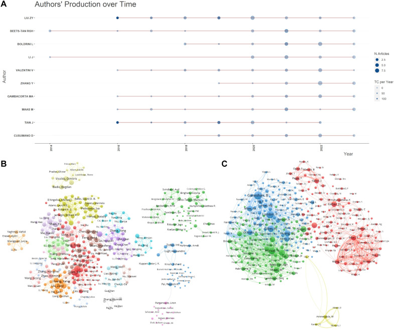
Figure 4.
Author publication and collaboration visualizations. (A) Author publication timeline graph: This graph displays the publication timeline of key authors over the period from 2013 to 2023. It visualizes the volume of publications per year for each author, allowing for a comparative analysis of productivity over time. The graph aims to highlight trends in individual research outputs and identify periods of heightened activity. (B) Author collaboration clustering network graph : This network graph illustrates the collaboration patterns among authors, showing how researchers are interconnected through their joint works. The nodes represent individual authors, with node size indicating the number of publications. Links between nodes depict collaborative relationships and clusters within the network suggest groups of authors who frequently collaborate. This visualization helps identify key researchers and their networks within the community. (C) Co-cited author collaboration network graph : This graph maps the relationships among co-cited authors, showing which authors are frequently cited together in the literature. Nodes in this network represent authors, with lines between them indicating that their works are commonly cited in conjunction with one another. The positioning and proximity of nodes reflect the strength of co-citation links, highlighting influential authors whose work is foundational or pivotal in the field.

