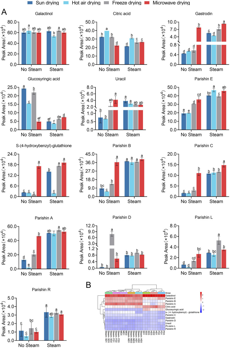
FIGURE 3.
Comparison of the levels of 13 quality markers in GR after applying the eight processing protocols. (A) Bar plots where bars with different letters differ significantly from each other (p < 0.05). (B) Heatmap showing the clustering of quality markers (rightmost column) and processing protocols (along the bottom of each column). Results are shown for three batches subjected to each protocol (marked as “1”, “2”, and “3”). Different superscript letters indicate significant differences (p < 0.05). The statistical analysis depicted in (A) entails one-way analysis of variance (Supplementary Table S3), and the normal distribution test is shown in Supplementary Table S2.

