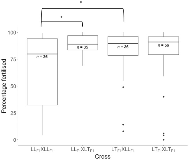
FIGURE 4.

Box plots depicting the distribution of fertilization success (percentage of multicell embryos post fertilization) of the crosses conducted between LLF1 and LKF1 colonies in December 2021. The dam and sire F1 parental group are listed first and second, respectively, in the cross labels on the x‐axis. The horizontal lines of the boxes represent the lower quartile, median, and upper quartile values, the “whiskers” represent the extreme values, and dots represent single outlier datapoints. Sample sizes (number of fertilization reactions) are shown below each median line for each offspring group; note that duplicate counts were conducted for each unique pair of colonies crossed and that one duplicate was missing for the cross LLF1 × LKF1. Significant differences in fertilization success amongst the crosses have been inferred from Bayesian generalized linear mixed effects modeling and are annotated on the figure with *.
