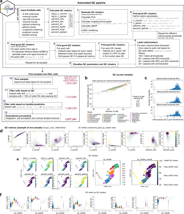
Extended Data Fig. 2. Overview of scAutoQC method.
a) Summary of the automated QC pipeline. Standard QC metrics are calculated and dimensions of 8 QC metrics (listed in step 2) are reduced, neighbours calculated and UMAP generated. Clusters from this UMAP are classified as “good” if ≥ 50% fall within upper and lower bounds (calculated by Gaussian Mixture Model) of 4 QC metrics (listed in step 4). Step 4–7 was repeated for 3 different mitochondrial thresholds (20%, 50%, 80%) and all steps were repeated for all samples. Finally samples are pooled, and cells within clusters that failed automated QC when mitochondrial threshold is 80%, and predicted as doublets (based on scrublet score calculated on a per sample basis) are removed before downstream processing. b) Plot of cells passing QC vs number of cells per sample across studies. Dotted line represents threshold for 100% of cells/sample passing QC. c) Histogram showing distribution of cells passing QC (log base 10) across the 3 mitochondrial thresholds. d-f) Example QC plots from one sample where d) is showing QC distribution of QC metrics where each data point is a cell, coloured by good_qc_cluster value (see step 8 of panel a). e) shows the QC UMAPs with the 8 QC metrics (listed in step 2 panel a), QC leiden clusters and good_qc_cluster value (see step 8 of panel a). f) violin plot of the 8 QC metrics (listed in step 2 of panel a) for each QC leiden cluster. In this sample for example, cluster 5 has failed QC because cells in this cluster have high % of mitochondrial reads, low genes and high percentage of genes expressed within the top 50 genes.

