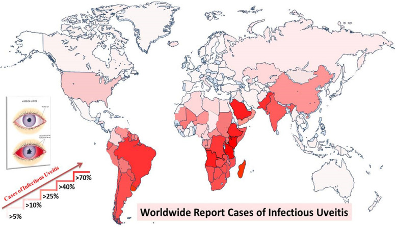
Fig. 3.
A global map representing the prevalence of infectious uveitis, with varying shades of red indicating different levels of prevalence. Areas with a lighter shade of red represent lower prevalence, while those with a darker shade of red indicate higher prevalence. This color gradient serves to visually illustrate the distribution and intensity of infectious uveitis across different regions worldwide (Prevalence rates may not be fully representative and lacked exact values due to differences in geographic regions, limited informations and diagnostic criteria)

