Figure 1.

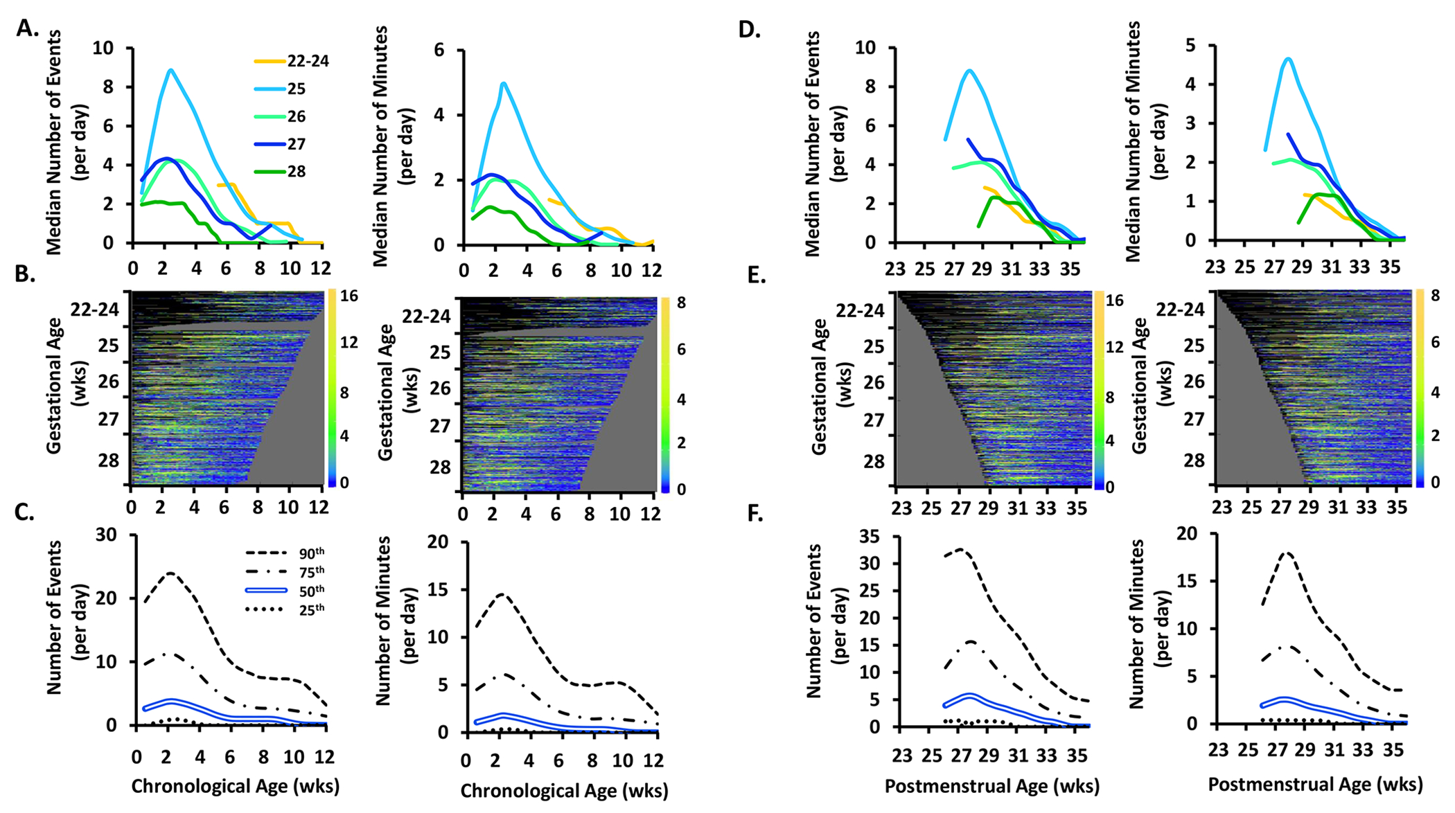
The frequency (number of events/day) and exposure (number of minutes/day) of apnea events by chronological age, postmenstrual age, and gestational age.
Top Row. Data plotted by chronological age are shown in A. and by postmenstrual age in D. Within A. and D., apnea frequency is shown on the left and apnea exposure is shown on the right. Infants are grouped by gestational age as noted in the within-figure key. Days with mechanical ventilation were excluded from apnea and periodic breathing quantifications. Due to the high rate of mechanical ventilation in the 22 to 24 gestational age infants, values were not available during the first 5 weeks of life in this youngest infant cohort.
Middle Row. B. and E. show heat maps in which each colored row represents an individual infant, sorted by gestational age on the y-axis. Dark blue indicates 0 or few events while orange indicates a high incidence of events, with the actual number of events shown in the corresponding color code on the right Y-axis of each heat map. Black indicates no available data (days on mechanical ventilation were excluded for apnea and periodic breathing heat maps and also denoted in black). Grey haystack at the right indicates data truncation when an infant reached 36 weeks 6 days postmenstrual age. Yellow color indicates a higher frequency or exposure of events. The right edges of the heat maps plotted by chronological age (A.) are irregular because of varying times of death or discharge. The left edges of the heat maps plotted by postmenstrual age (B.) are irregular because of varying times of birth.
Bottom Row. C. and F. shows results for the entire cohort as the median (double blue line), 25th (dotted line), 75th (dot and dashed line) and 90th (dashed line) percentiles.
