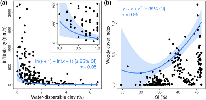
FIGURE 2.

Application of quantile regressions to empirical datasets, for comparison with our proposed boundary line method (as in Figure 3a,c). The forms (log–log and parabolic, respectively) and quantiles (𝜏; 5% and 95%, respectively) of each relationship regressed are noted in blue. Pale‐blue bands represent the 95% confidence intervals (CI) about the regression lines. In (a), the inset highlights the lower‐left corner of the data (as in Figure 3a), with the same quantile regression plotted.
