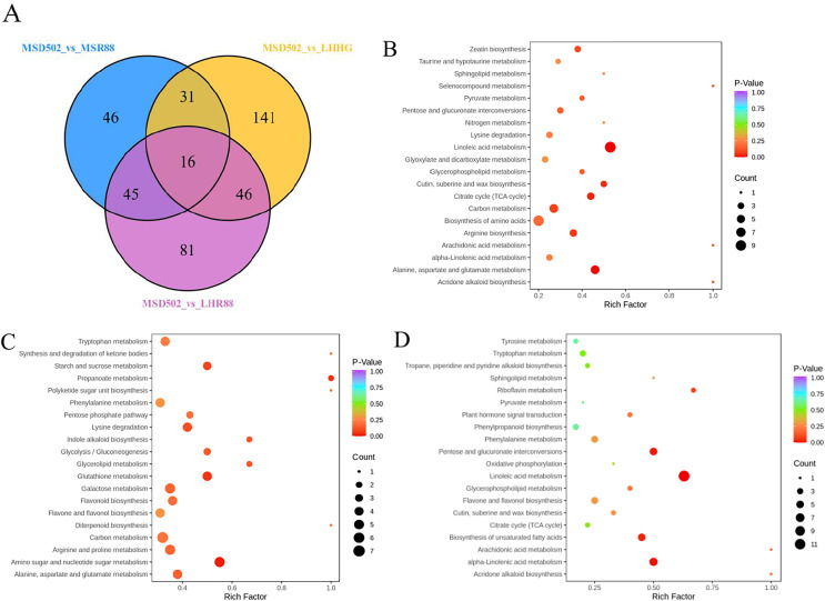
Figure 4. Visual representations including Venn diagrams and bubble diagrams were utilized to illustrate comparisons among three distinct sets of differentially expressed metabolites (MSD502_vs_MSR88, MSD502_vs_LHHG, MSD502_vs_LHR88).
A Venn diagram (A) was employed to showcase both shared and unique metabolites across these comparison groups. Additionally, (B–D) present KEGG enrichment analyses for differentially expressed metabolites within each group (MSD502 vs. MSR88/LHHG/LHR88). Each individual bubble within these figures corresponds to a specific metabolic pathway; its position on an axis as well as its size collectively indicate its level of influence within that particular pathway. Larger bubbles signify greater influence factors. Furthermore, variations in bubble color reflect p values obtained from enrichment analysis with darker colors indicating higher degrees of enrichment.

