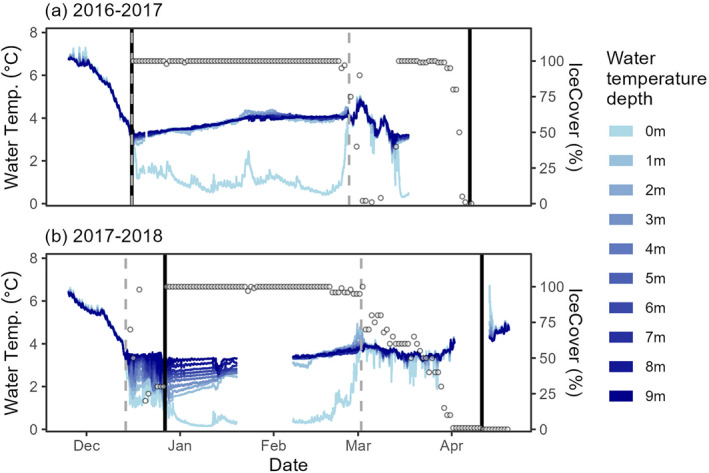
Figure 6.

High‐frequency (every 15 min) data from (a) 2016–2017 and (b) 2017–2018 winters. The blue line shade indicates the depth of each temperature sensor (left y‐axis). Open circles indicate the daily percentage of ice cover (right y‐axis). The vertical solid line indicates visually assessed ice‐on and ice‐off whereas the vertical dotted line indicates the ice‐on and ice‐off based on temperature differences between the top and bottom temperature sensors (Pierson et al., 2011).
