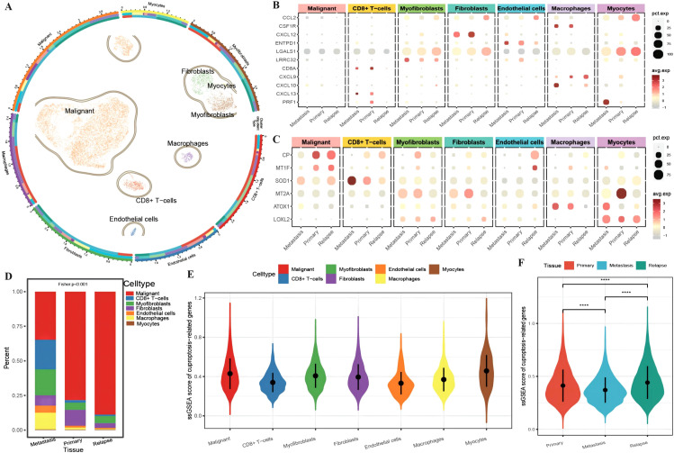
Figure 1.
Differences in the tumor microenvironment at the single-cell level. (A) UMAP distribution map of cell clustering and annotation results, where the circles represent cell annotation results. From outer to inner, they respectively indicate cell type, sample source, and tissue type; (B) Bubble plot of the expression of anti-tumor immune and anti-tumor response genes combined with different cell types from various tissue sources, with the size of the dots representing the number of cells expressing the genes and the color indicating the level of expression; (C) Bubble plot of the expression of ferroptosis-related marker genes combined with different cell types from various tissue sources, with the size of the dots representing the number of cells expressing the genes and the color indicating the level of expression; (D) Bar chart depicting the distribution of cell types in different tissues, with different colors representing different cell types; (E) Violin plot showing the enrichment scores of ferroptosis-related genes in various cell clusters; (F) Violin plot illustrating the differences in ferroptosis enrichment scores among primary tissue, metastatic tissue, and recurrent tissue. The blue color represents cells from metastatic tissue, red indicates cells from primary cancer tissue, and green represents cells from recurrent tissue. ****p < 0.0001.

