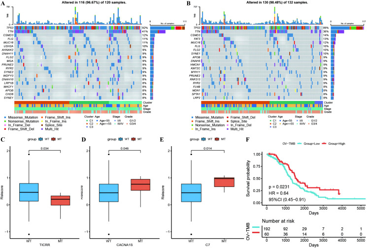
Figure 10.
Differences of gene mutant enrichment in Riskscore model. (A) Waterfall plot of the top 20 genes’ SNV mutation frequencies in the high-risk group; (B) Waterfall plot of the top 20 genes’ SNV mutation frequencies in the low-risk group; (C–E) Box plots illustrating the difference in Riskscore between mutated and wild-type groups for genes with significantly different mutation frequencies between high and low-risk groups, where red represents the mutated group and blue represents the wild-type group; (F) Survival curve comparison between high and low TMB groups, where red represents the high TMB group and blue represents the low TMB group.

