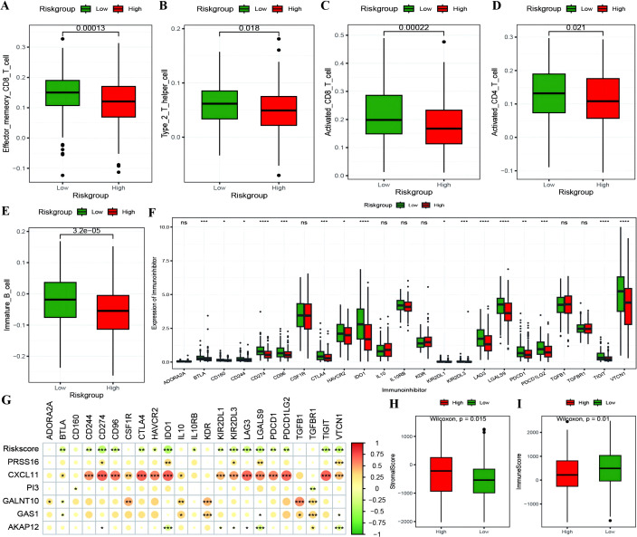
Figure 9.
The correlation between RiskScore and immune checkpoints. (A–E) Box plots showing the differences in proportions of immune-infiltrating cells between high and low-risk groups calculated using the ssGSEA algorithm, where red represents the high-risk group and green represents the low-risk group; (F) Box plot illustrating the expression differences of 23 immune checkpoint inhibitors between high and low-risk groups, where red represents the high-risk group and green represents the low-risk group; (G) Heatmap of the correlation coefficients between the expression of model genes, risk scores, and the expression of immune checkpoint inhibitors, where the color of the dots represents the strength of the correlation, and “*” denotes significance; (H, I) Box plots displaying the differences in stromal score and immune score between high and low-risk groups. *p < 0.05, **p < 0.01, ***p < 0.001, ****p < 0.0001.

