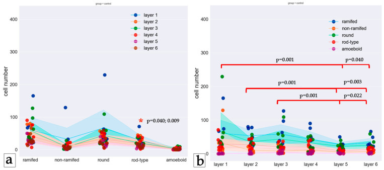
Figure 3.
Distribution of microglia phenotypes in layers of the control group. (a) Phenotypes are shown in columns, and the layers are indicated by the color of the dots. (b) Layers are shown by columns, while phenotypes are represented by different colors of dots. Dots represent the number of cells, and lines represent the mean cell number according to the color scheme. Brackets point to significant differences in the number of cells between layers. Asterisks point to significant differences in the phenotype distribution in the layer. The Friedman test was used to analyze related samples.

