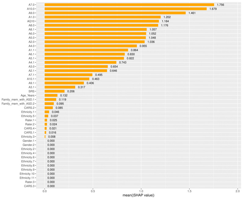
Figure 7.
Shapley additive explanation (SHAP) absolute value bar plot. The x-axis represents the mean absolute SHAP value for each feature, showing how much each feature contributes to the model’s predictions on average. The y-axis lists the features in descending order of importance, with the most important features at the top.

