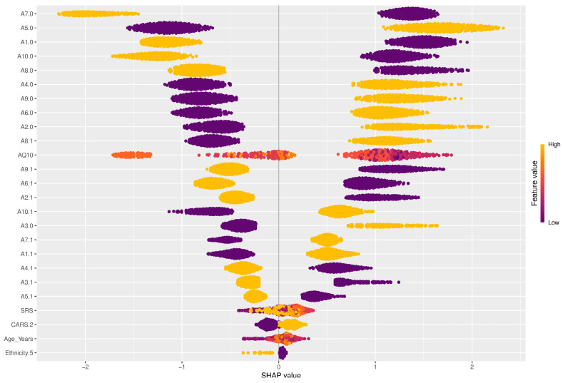
Figure 8.
SHAP bee-swarm plot. The x-axis represents the SHAP value, which indicates the direction and magnitude of each feature’s effect on the prediction. The y-axis lists the features in order of importance, with the most influential features at the top. The color of the dots represents the value of the feature, from low (purple) to high (yellow).

