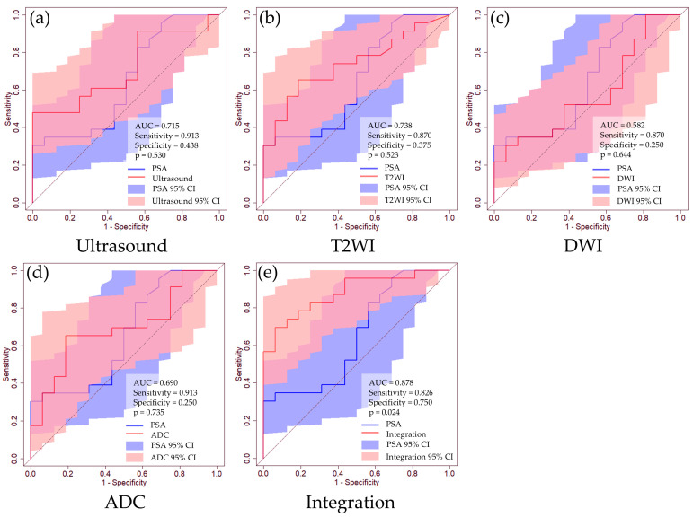
Figure 3.
ROC curves of clinically significant PCa prediction using routine clinical data. (a) Ultrasound image, (b) T2WI, (c) DWI, (d) ADC, (e) integrated medical data. The blue line represents the ROC curve for the PSA level, while the red line corresponds to the ROC curve for each dataset. The blue-shaded region indicates the 95% CI for PSA, and the red-shaded regions represent the 95% CIs for each dataset. We determined the thresholds using the Youden index.

