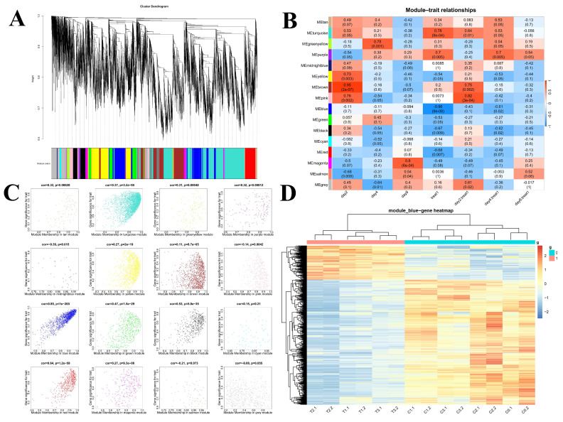
Figure 3.
WGCNA. (A) The partitioning of gene modules. This figure illustrates the clustering of genes, and the division of gene modules is based on this result. The branches of the same color were assigned to the same gene module. (B) Associations between modules and traits. Panel A illustrates the correlation between gene module and sample information, with the x-axis representing sample information and the y-axis representing each gene module. The color intensity indicates the strength of the correlation, with red representing a positive correlation and blue representing a negative correlation. The p-value, which represents the significance value, is provided in brackets. (C) Scatterplots of gene significance (GS) (y-axis) versus module membership (MM) (x-axis) for sixteen modules. This figure illustrates the degree of significance attributed to the genes within the sixteen modules. (D) The clustering heatmap demonstrates the expression of 838 genes within the blue module.

