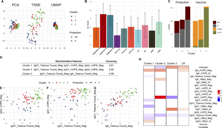
Fig 3. VAST data visualization and analysis results.
A: Visualization by PCA, t-SNE, and UMAP with the protection status and cluster membership of individuals marked by different shapes and colors (NP: not protected; P: protected); B: Bar graphs showing the point (heights of the bars) and 95% confidence interval (black lines) estimates of CV AUCs by GeM-LR and the competing methods. C: Stacked bar chart highlighting the distribution of protection status and the two vaccines within each cluster; D: Identified discriminative features for all three clusters with the corresponding Accuracy Ac(h); E-G: Scatter plots on the selected features with individuals color-coded by their cluster memberships. The x- and y-axes represent the normalized values of the corresponding variables. H: Heatmap for visualizing GeM-LR and LR regression coefficients; The regression coefficient values are color-coded from red (larger) to blue (smaller).

