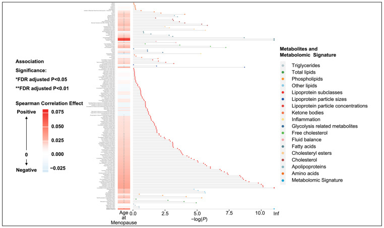
Figure 1.
Heatmap and dot–bar plot for the association between age at menopause and all metabolomic biomarkers. The x-axis represents the false-discovery rate (FDR)-adjusted p-value after negative logarithmic transformation, and the y-axis represents the metabolites, sorted by their groups and the significance of associations. *: FDR-adjusted p-value < 0.05; **: FDR-adjusted p-value < 0.01.

