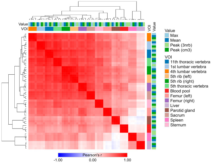
Figure 2.
Heatmap and clustering analysis of SUV metrics across different VOIs. The heatmap illustrates the Pearson correlation coefficients (r) among different SUV metrics, including maximum, mean, and peak values, across different volumes of interest (VOIs). Each square in the heatmap represents the correlation between two variables, with red indicating positive correlations and blue indicating negative correlations. The color intensity corresponds to the strength of the correlation, with darker shades indicating stronger correlations. Hierarchical clustering on both axes organizes the VOIs and metrics, grouping together those with similar correlation patterns.

