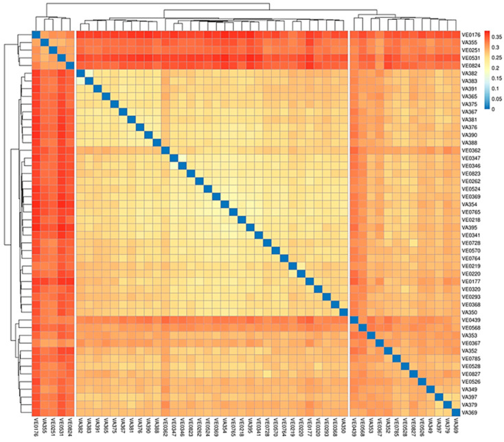
Figure 3.
Heatmap showing the p-distance matrix for the 50 genotypes. The heatmap plot depicts the discrepancy of each sample by color intensity. The higher the value, the closer to red, and thus the larger is the discrepancy between two samples. The dendrograms on the top and on the left indicate the genetic relatedness between samples according to the p-distance matrix.

