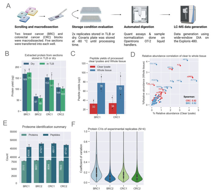
Figure 2: Method Optimization for MMD Samples.
A. Schematic showing MMD sample collection and processing. Proteomics data for this figure was generated on an Exploris 480.
B. Bar plots showing comparable protein yields (n=2 scrolls per condition) across both storage conditions. The height of each bar represents the mean, with error bars indicating the standard deviation.
C. Bar plot showing enhanced peptide yields from whole tissue loaded on the S-Trap compared to clear lysates only. Demonstrated with BRC1 (n=2) and CRC1 (n=2) samples. The height of each bar represents the mean, with error bars indicating the standard deviation.
D. Comparison of relative abundance across shared proteins identified from clear lysate and whole tissue. Relative abundance is calculated by dividing each protein’s abundance by the total protein abundance for each sample. Both methods show strong Spearman correlation.
E. Unique protein and peptide identifications from MMD tissue with a median area of ~57 μm2 for CRC and BRC samples (n=4). The height of each bar represents the mean, with error bars indicating the standard deviation.
F. Protein abundance CVs among experimental replicates (n=4) for each block. The violin plot illustrates data distribution based on the kernel density estimate (KDE). The inner lines represent the 25th, 50th, and 75th percentiles of the IQR range.

