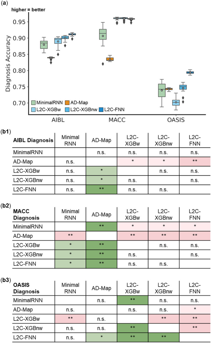
Figure 6. Cross-cohort clinical diagnosis prediction accuracy (mAUC) on three external test datasets.

(a) Boxplots display the variability across 20 trained models (from ADNI) for clinical diagnosis prediction assessed using mAUC. The x-axis denotes the test dataset used for evaluation. (b) Statistical significance in the prediction error between all models. Each row shows the statistical difference between a model and all other models. For example, the first row of each 5 × 5 table corresponds to the statistical difference between MinimalRNN and other models – green indicates that MinimalRNN performs better, while red indicates that MinimalRNN performs worse. Therefore, the colors are always flipped between red and green across the diagonal. “*” indicates p < 0.05 and statistical significance after multiple comparisons correction (FDR q < 0.05). “**” indicates p < 0.001 and statistical significance after multiple comparisons correction (FDR q < 0.05). “***” indicates p < 0.00001 and statistical significance after multiple comparisons correction (FDR q < 0.05). “n.s.” indicates no statistical significance (p ≥ 0.05) or did not survive FDR correction.
