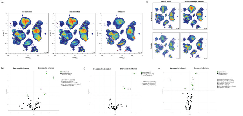
Figure 4.
Cellular immunome post-vaccination predicts subsequent SARS-CoV-2 infection. (A) All samples following full vaccination (n = 68) are displayed in the UMAP density plots based on their subsequent infection (n = 17) defined by a positive PCR test. (B) Volcano plot comparing the clusters identified in Table 1 and Figure 1 based on subsequent infection (n = 17). (C) UMAP density plots of the infected and non-infected samples are displayed for healthy adults and oncohaematologic patients. Volcano plots comparing infected versus non-infected (D) healthy adults (n = 7 and n = 16, respectively) and (E) oncohaematologic patients (n = 9 and n = 20, respectively). For the UMAP plots, the colour code is based on the intensity, where red represents higher expression and blue represents lower expression. For the volcano plots, differentially expressed clusters (p < 0.05) in the comparisons are highlighted in green. Due to the low number of events, some clusters could not be analysed in (D) (plasmablasts, CD4 – CD8 – T-cells [2] and TEMRA Tγδ cells [4]).

