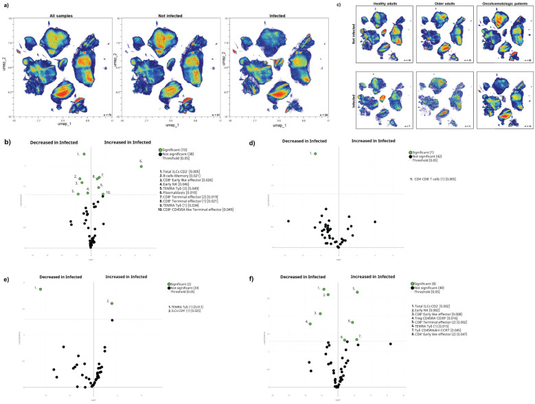
Figure 5.
The pre-vaccination cellular immunome predicts SARS-CoV-2 infection. (A) All samples before the first vaccine dose (n = 75) are displayed in the UMAP density plots based on their subsequent infection. (B) A general volcano plot comparing the clusters identified in Table 1 and Figure 1 before vaccination based on subsequent infection. (C) UMAP density plots of the cohorts before being vaccinated are shown with the following colours: blue (healthy adults), purple (older adults) and green (oncohaematologic patients), relative to all samples (shown in black). Specific volcano plots of infected versus non-infected (D) healthy controls (n = 7 and n = 16, respectively), (E) older adults (n = 3 and n = 15, respectively) and (F) oncohaematologic patients (n = 14 and n = 20, respectively) are also shown. For the UMAP plots, the colour code is based on the intensity, where red represents higher expression and blue represents lower expression. For the volcano plots, differentially expressed clusters (p < 0.05) in the comparisons are highlighted in green. Due to the low number of events, some clusters could not be analysed in (D) (CD45RA – /CD39 + Tregs, non-classical monocytes, plasmablasts, CD4 – /CD8 – T-cells [2] and TEMRA Tγδ cells [4]) and (E) (classic monocytes [2], CD45RA – /CD39 + Tregs, non-classical monocytes, plasmablasts, CD4 – /CD8 – T-cells [2], TEMRA Tγδ cells [4] and TEMRA Tγδ cells [5]).

