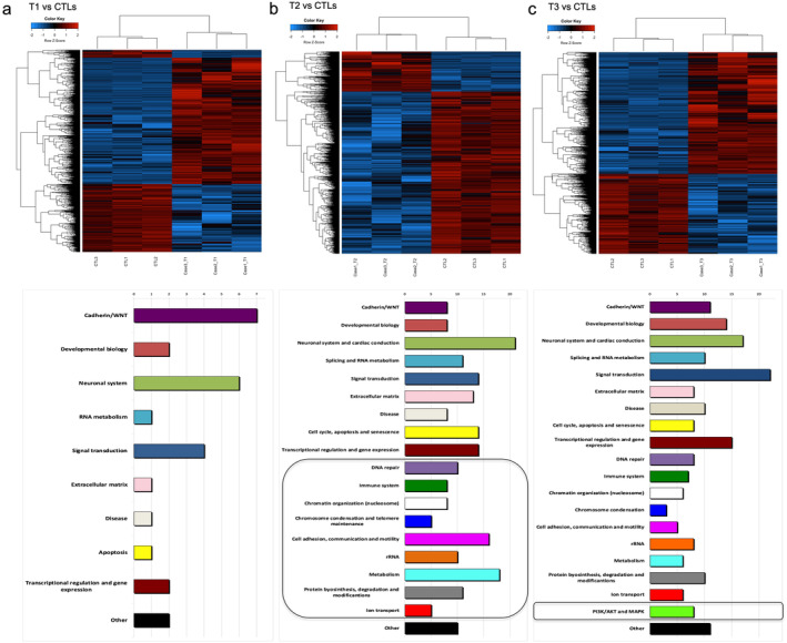
FIGURE 3.

Summary of DNA methylation and pathways analysis. Supervised heatmaps (top) and enriched pathways (bottom) identified from DMRs annotation in the 1qJT cases analyzed versus controls at T1 (panel a), at T2 (panel b), and at T3 (panel c). Patients in the heatmaps are represented in the columns and CpGs in the rows. Blue and red heatmap colors refers to hypo‐ and hyper‐methylation, respectively as indicated in the top left color key legend. x‐axis on pathway histograms represented the number of pathways in each category, as reported by Arabic numbers on the top; black squares underline categories that emerged as new at each timepoint.
