Figure 2.
mIF analysis of immune cells in the breast cancer microenvironment
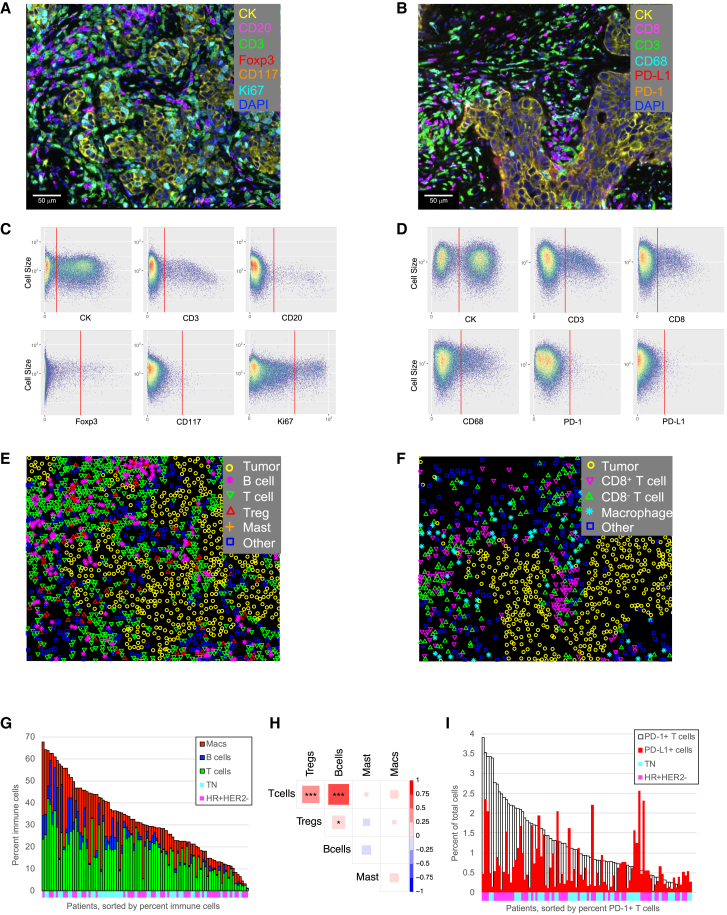
(A) Example breast cancer tissue stained with mIF panel 1. Cells are pseudo-colored as indicated for the different markers.
(B) Example breast cancer tissue stained with mIF panel 2. Cells are pseudo-colored as indicated for the different markers.
(C) Example of auto-generated gates for each marker in mIF staining panel 1.
(D) Example of auto-generated gates for each marker in mIF staining panel 2.
(E) Phenotype map corresponding to the image in (A).
(F) Phenotype map corresponding to the image in (B).
(G) Immune cell densities across the entire cohort (n = 98 patients). Patients sorted by percentage of immune cells, colored by cell phenotype. Annotations along the x axis indicate receptor subtype (cyan: TN; magenta: HR+HER2−).
(H) Correlation of immune cell populations across patients (n = 98 patients). Pearson correlations, red indicates positive correlation, blue indicates negative correlation. ∗p < 0.05, ∗∗p < 0.01, ∗∗∗p < 0.001.
(I) Association of PD-1+ T cell density (white bars) with PD-L1+ cell density (red bars). Patients sorted by percentage of PD-1+ T cells (n = 98 patients). Annotations along the x axis indicate receptor subtype (cyan: TN; magenta: HR+HER2−).
See also Table S1.

