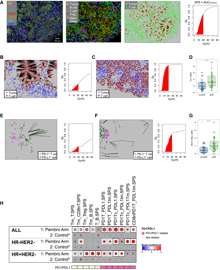
Figure 5.
Spatial proximity of cells in the tumor microenvironment is associated with response to ICB
(A) Example of a tumor stained with mIF panel 1, the corresponding phenotype map, and a nearest-neighbor plot in which lines are drawn from each tumor cell (yellow) to the nearest T cell (green). A plot of G(r), the fraction of tumor cells with a T cell with a radius r, by r (μm) is shown. A spatial proximity score (SPS) is calculated from the area under this curve where r = 0 to 20 μm (red shaded area).
(B) Nearest-neighbor plot in which lines are drawn from each tumor cell (red) to the nearest T cell (blue) and associated G(r) plot from a tumor with a low tumor-to-T cell spatial proximity score (Tm_T.SPS).
(C) Nearest-neighbor plot in which lines are drawn from each tumor cell (red) to the nearest T cell (blue) and associated G(r) plot from a tumor with a high tumor-to-T cell spatial proximity score (Tm_T.SPS).
(D) Boxplot illustrating significantly higher Tm_T.SPS in patients who achieved a pCR. The data are depicted as individual dots for each sample, along with the median, first, and third quartile (n = 54 patients). Statistical analysis was performed using the likelihood-ratio test. ∗∗p < 0.05 (BH corrected).
(E) Nearest-neighbor plot in which lines are drawn from each PD-1+ T cell (green) to the nearest PD-L1+ cell (magenta) and associated G(r) plot from a tumor with a low PD-1+ T cell to PD-L1+ cell spatial proximity score (PD1T_PDL1.SPS).
(F) Nearest-neighbor plot in which lines are drawn from each PD-1+ T cell (green) to the nearest PD-L1+ cell (magenta) and associated G(r) plot from a tumor with a high PD-1+ T cell to PD-L1+ cell spatial proximity score (PD1T_PDL1.SPS).
(G) Boxplot illustrating significantly higher PD1T_PDL1.SPS in patients who achieved a pCR. The data are depicted as individual dots for each sample, along with the median, first, and third quartile (n = 54 patients). Statistical analysis was performed using the likelihood-ratio test. ∗∗p < 0.05 (BH corrected).
(H) Association dot matrix showing the level and direction of association between spatial proximity scores (columns) and pCR in the population/model as labeled (rows). Only those biomarkers that were significant (p < 0.05; after Benjamini-Hochberg multiple testing correction) in at least one cohort are shown. See Figure 3 legend for number of patients in each cohort (multi-IF platform). Color of dot indicates direction of association (red, higher in pCR; blue, higher in non-pCR). Size of dot is proportional to significance (larger dots → smaller p values). Background square color indicates: BH FDR p < 0.05 (white), nominal p < 0.05 (light gray), not significant (dark gray). See also Figure S5 and Tables S4 and S5.

