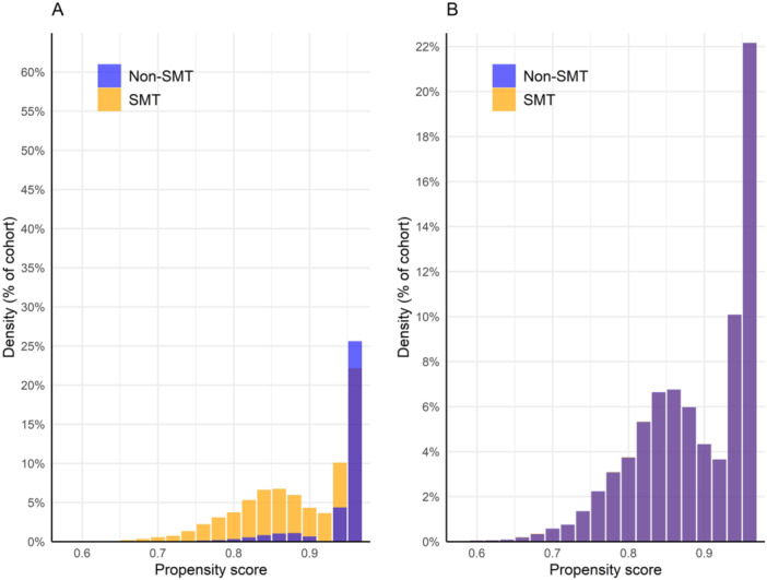
Figure 1.

Propensity score density graph. Propensity scores before (A) and after (B) matching. The orange bars represent the spinal manipulative therapy (SMT) cohort while the blue bars represent the non‐SMT cohort. After matching, propensity score densities overlap closely, suggesting adequate covariate balance.
