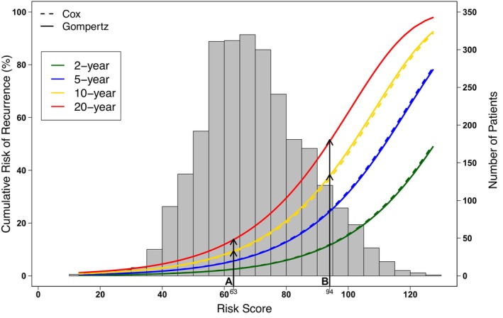
FIGURE 3.

The curves represent the predicted risk of recurrence (%) determined by the Cox model (dashed lines) or the Gompertz model (solid lines) at 2, 5, 10 and 20 years in green, blue, yellow, and red, respectively. The histogram refers to the Risk Score distribution in the study cohort; each bar indicates the number of patients with that specific Risk Score.
