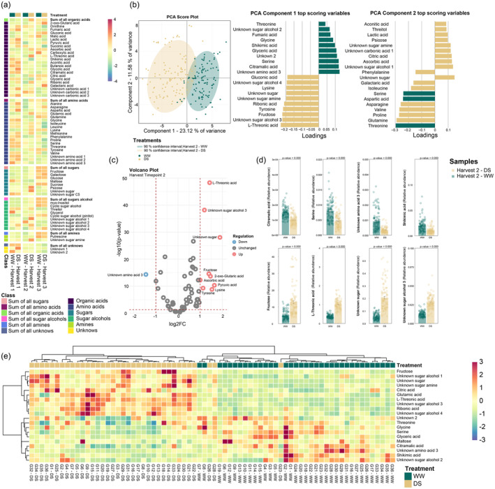
Figure 4.

(a) Heatmap ‐ Metabolic changes in leaves under drought stress (left to right) harvest time point 1 (19 DASt), harvest time point 2 (24 DASt), harvest time point 3 (45 DASt). Metabolic changes are presented as means of each treatment. Colours indicate increases (red) and decreases (blue). (b) PCA Score plot and PC1 and PC2 top‐ranked metabolites in harvest time point 2. The top 20 scoring loadings (10 highest and 10 lowest) of PC1 and PC2 are shown by row for each PCA. Bar colours indicate the experimental condition in which each top‐scoring metabolite is more regulated. Ellipses show a 90% confidence interval. Different colours indicate different experimental conditions (n = 108 biologically independent replicates). (c) Volcano plot generated with a 216‐observation dataset (108 well‐watered (WW) samples and 108 drought‐stressed (DS) samples) comprised of 63 metabolites at harvest time point 2. Red circles represent metabolites with a fold change ≥2 that was statistically significant (P‐value ≤ 0.05). Blue circles represent metabolites with a fold change ≥2 lacking statistical significance (P‐value > 0.05), while grey circles represent metabolites with a fold change ≤2. The identity of the most discriminating metabolites highlighted in the plot as red and blue circles are described in bar plots. (d) Barplot visualization of the highlighted metabolites in WW and DS conditions. Error bars represent the standard error on the 108 replicates. (e) Hierarchically clustered heatmap of the 36‐chickpea genotypes using the top 20 metabolites with higher loadings in the first component of PLS‐DA. The bi‐clustering uses the average linkage of Pearson correlation distance between chickpea genotypes and metabolites. Metabolic changes are presented as means of 3 replicates. Colours indicate increases (red) and decreases (blue).
