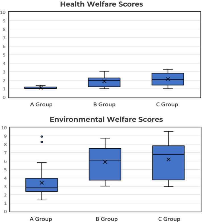
Figure 2.
Box plot of S-AWAG scores for 11 animal species across zoo groups. The y-axis shows S-AWAG scores (1 = best, 10 = worst), and the x-axis categorizes zoo groups (Group A: AZA-accredited zoos, Group B: large unaccredited zoos, and Group C: small unaccredited zoos). The boxplots display the median, interquartile range (IQR), and any outliers. The central line in each box indicates the median (50th percentile), and the box encompasses the interquartile range (IQR) between the 25th and 75th percentiles. The whiskers extend to 1.5 times the IQR, highlighting the range of the data, while outliers are shown as individual points beyond the whiskers. In the health welfare plot, Group A has the narrowest range and lowest median, suggesting better welfare conditions, while Groups B and C show greater variability. Similarly, in the environmental welfare plot, Group A displays lower scores, whereas Groups B and C show higher variability and poorer welfare. These boxplots highlight welfare disparities across zoo groups, particularly emphasizing areas for improvement, particularly in smaller, non-accredited zoos.

