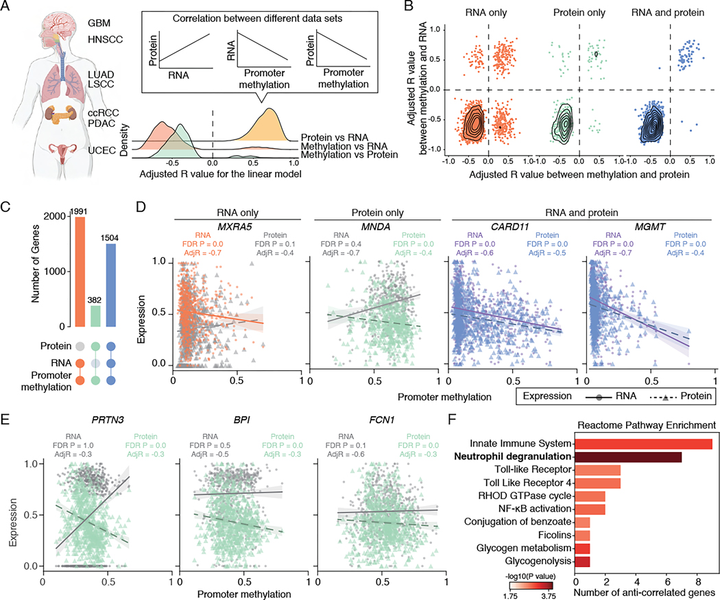
Figure 1. Correlations between promoter DNA methylation, transcriptome, and proteome.
(A) Left: A schematic of tumor types collected for this study. Right: Density plot showing the distribution of adjusted R values between protein abundance and RNA expression (yellow), promoter methylation and RNA expression (orange) or protein abundance (green).
(B) Scatter plot showing adjusted R values distribution for genes with promoter methylation correlated with RNA (left, orange), protein (middle, green), or both RNA and protein (right, blue).
(C) Upsetplot showing the breakdown of genes based on their correlation with promoter methylation and RNA/protein expression.
(D) Examples with distinct correlations between promoter methylation, RNA expression, and protein abundance. Each dot represents one tumor, with the solid line representing the correlation between scaled RNA and promoter methylation, and the dashed line representing the correlation between scaled protein abundance and promoter methylation. Significant correlations are highlighted (orange: RNA only; green: protein only, blue and purple: RNA and protein).
(E) Examples of anti-correlated genes with promoter hypermethylation, exhibiting upregulation at the RNA level and downregulation at the protein level.
(F) Pathway enrichment analysis of the 31 anti-correlated genes with promoter hypermethylation, showing upregulation at the RNA level and downregulation at the protein level. Pathway with FDR P-value <0.05 is highlighted in bold.
See also Figures S1, S2, and Table S1.

